
Have you ever looked at a painting and felt something — without knowing exactly why? Maybe a deep calm washed over you… or maybe you felt a strange tension in your chest. Often, it’s not the subject that moves us — it’s the color.
In abstract art, where form and realism take a back seat, color becomes the main storyteller. It shapes the mood, evokes emotion, and creates connection. But how? And why? Let’s explore the power of emotional color theory — and how you can use it to make your abstract art even more impactful.
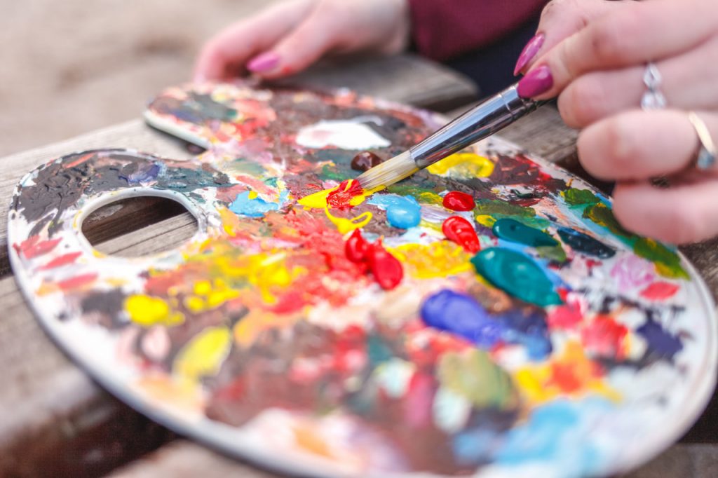
Colors Are Emotional
Colors affect us on a psychological level. They bypass rational thought and speak directly to our feelings. That’s why we associate red with passion, blue with calm, yellow with joy. But the truth is more complex:
Red can mean love — or rage.
Blue can soothe — or sadden.
Yellow can energize — or overwhelm.
It’s all about context, intensity, and combination.
In abstract painting, where color isn’t tied to a specific object, its emotional power is amplified. Without visual cues to guide interpretation, viewers feel first, think second. That’s why choosing your color palette with intention can transform your work from simply beautiful — to deeply moving.
The Language of Colors
Here’s a brief look at what colors often convey:
- Red – Energy, desire, anger, urgency, passion
- Blue – Tranquility, sadness, depth, distance
- Yellow – Happiness, optimism, anxiety, stimulation
- Green – Growth, harmony, renewal, envy
- Purple – Mystery, creativity, spirituality, luxury
- Black – Power, silence, grief, elegance
- White – Purity, openness, emptiness, peace
Remember: these meanings aren’t fixed. They shift based on culture, personal experience, and how the colors are used together.
Building an Emotional Palette
In abstract art, your color choices don’t need to follow traditional rules. You’re not painting trees, skies, or buildings — you’re painting emotion.
So ask yourself before you begin:
- What feeling do I want to express?
- What energy do I want the viewer to receive?
- Do I want tension — or flow? Drama — or stillness?
Then, let color lead.
You can also experiment with contrast: warm vs cool, vibrant vs muted, light vs dark. These contrasts create rhythm and emotional movement across the canvas.
Letting Color Be the Guide
Some of the most powerful abstract pieces come from artists who don’t overthink — they let their feelings guide their brush. Instead of choosing color based on theory, they choose it based on instinct.
“I don’t know why I picked orange… it just felt right.”
And often, those gut decisions are where the real magic lives.
So while understanding emotional color theory is helpful — don’t let it become a cage. Use it as a foundation, not a formula.
Creating Connection Through Color
In the end, abstract art is a conversation — not a statement. And color is the voice that starts that conversation. When you paint from emotion, your viewer can feel it. They don’t need to understand your work intellectually to connect with it deeply.
They may not know what your painting is about…
But they’ll know exactly how it makes them feel.